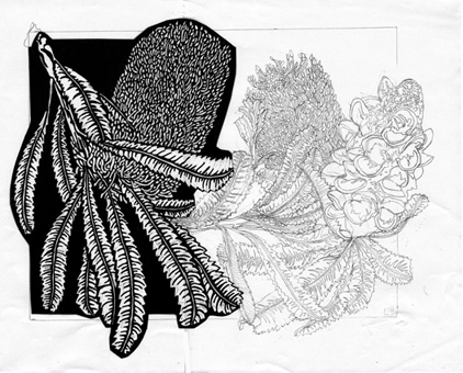
After working through design ideas and adding them lightly over the template (size/shape of the basic linocut from the DESIGNART series) I settled on the seedpod over to the right of the template and spilling off. It needed something else so after consulting my plant and photos I decided to add a more ‘ragged’ representation of the flower head after it has opened and is starting to head towards fading from its robust bloom into the ‘softer’ and then wilted phase leading to the seedpods. This is the added on drawing I came up with.
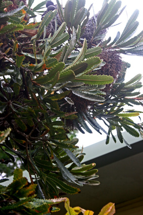
I have then been struggling with the ‘joining’ of the original drawing and the new section – especially as I worked not from the original drawing but the b&w design phase. trying to get the leaves ‘just right’ as been frustrating. Here is one of the images from my plant that I used where you can see all those new growth leaves all falling out over each other.
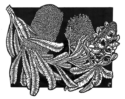
Eventually I have ended up with 2 images that I have been ‘sitting with’ and deciding which one I will use or which combination I may adjust. I will post more when I start carving. I have actually made a decision.
Just wondering as an exercise for those inclined to design – what would you do?


I don’t have any sort of design background, but the one on the left appeals to me a little bit more. I dunno!
I think there’s a better balance of positive & negative shapes in the second of the two. But neither design really offends me.
Gah! It sent before I was finished, sorry. What I meant by the “neither really offends me” is that they’re both similar, both very strong designs, and I think you could successfully utilize either.
Yes Bronwen and Annie – but as Part 3 explains ended up back where I started…sometimes I think too much..I think!!! LOL