I was away in the Southern Highlands and Batemans Bay visiting relatives & taking some on holidays for most of March – it was a lovely break & I even managed to sneak in a bit of art making.
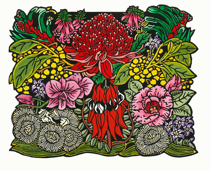
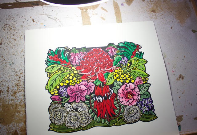
Before I left I managed to complete this new design – Australian Floral Emblems 2014.
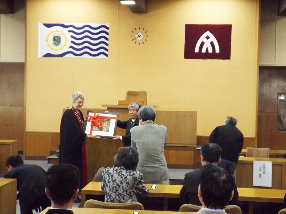
It was commissioned as a gift for Lismore City Council’s Sister City – Yamato-Takada – for the Lismore City Council Mayor and General Manager’s visit which is currently underway and joins the previous purchase by Lismore City Council and Yamato-Takada 50th Anniversary of the first Sister City relationship program in August 2013. My linocut was presented yesterday by Mayor Jenny Dowell of Lismore City Council to Mayor Yoshida of Yamato-Takada Council.
Australian Floral Emblems 2014 – a Fine Art Handpainted Linocut by Lynette Weir
This Fine Art Linocut Limited Edition Relief Print takes the Floral Emblems for each State or Territory of Australia and weaves them into a design held together by the Australian Floral Emblem – the Golden Wattle – Acacia pycnantha.

Victoria – Common Heath – Epacris impressa
Tasmania – Tasmanian Blue Gum – Eucalyptus globulus
Australian Capital Territory – Royal Bluebell – Wahlenbergia gloriosa
South Australia – Sturts Desert Pea – Swainsona formosa
Western Australia – Mangles Kangaroo Paw – Anigosanthos manglesii
Northern Territory – Sturts Desert Rose – Gossypium sturtianum
Queensland – Cooktown Orchid – Dendrobium phalaenopsis
New South Wales – Waratah – Telopia speciosissima
The design begins as an idea in a small sketch, developed with a clear understanding of the structures of the wildflowers.
You can see the tiny thumbnail sketch showing the initial ideas sketch for the planning of this linocut in the top left hand corner of the image below. This little ideas sketch is then worked into drawings grounded in draughtsmanship.

The work is designed into a linocut/linoblock print in the tradition of fine art relief printmaking creating a template to follow for carving.I photocopy the initial drawing and ink in the black areas which allows me a guide to follow for carving out the white areas. I used to bot do this & found I often made mistakes in the carving which meant re-starting the carving of a whole new lino block! So this way I have a guide, not to say that I don’t vary this as I go – sometimes I will rework areas by drawing on the lino block itself. Some of my long term followers may remember my initial false start of this design a few years ago about the time my shoulder was playing up & making carving difficult. The less said about that the better – let’s just say even with the template mistakes still happen!!
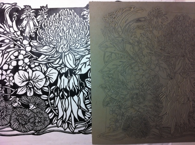
The image from the template is transferred in reverse to the lino block for carving using carbon paper.
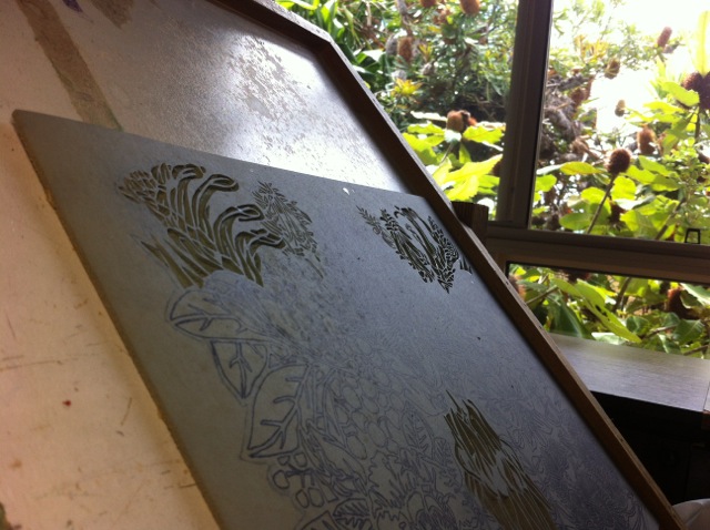
A view from my srawing/carving/painting board out to the native banksias outside my studio window.
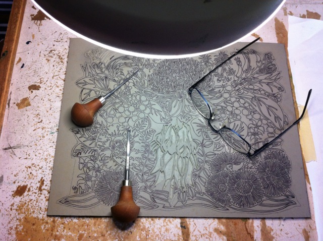
I use a swivel table set at just the right height, strong lamp, specific reading glasses for close work & very sharp lino tools for the carving the lino block.
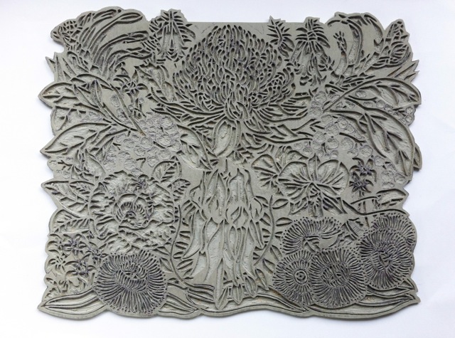
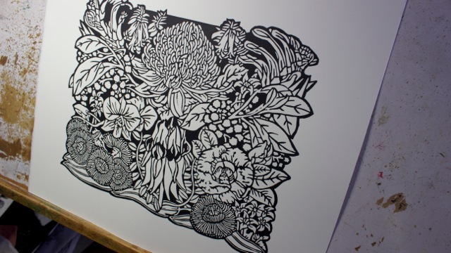
The completed fully carved linoblock!
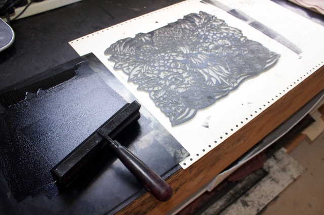
A roller is used to ink up a glass plate and then roll over the lino block to transfer the ink. It is important to get an even thin layer of ink to transfer the image to the paper.
This is the lino block fully inked & ready to print. The more even & carefully applied the ink is to the block the better quality print you will achieve. Note that the design is carved in mirror reverse so that when it is inked and the paper placed on it fro the print it reverses and comes out the right way!! This is particularly important if you are using type or writing within your printmaking!!!
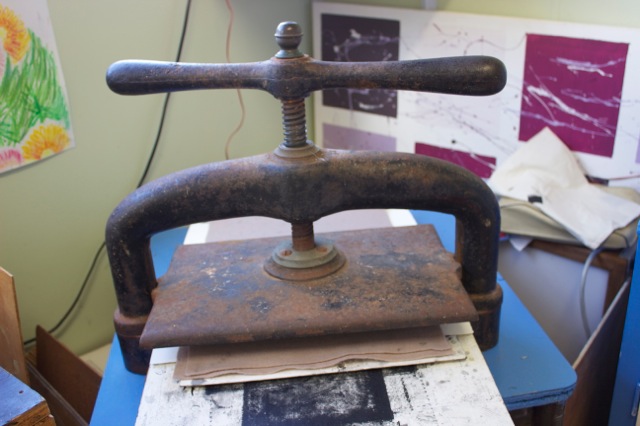
The paper is placed on top of the lino block and a felt is placed over that to help distribute the weight of the press evenly & not damage the paper & lino block in the process. I use a small wind down book press which lowers a heavy plate onto the block.

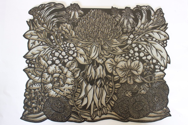
This is the very first print from the carved lino block. It is instantly gratifying to pull a lovely print the very first time. Sometimes the stars align!! But often they don’t! It may take numerous attempts before you get a good quality even print or edition.
This is the first ‘working proof print’ that has some imperfections in the printing. I use this to work on the first handpainting.
I use oil based ink for the printing & watercolours for the handcolouring. It is the old adage of ‘oil repels water’ so the watercolour is mostly contained within the oil printing. Although sometimes there will be the need to come back & remove some of the more opaque colours that may run onto the oil printed sections but it comes off easily without taking off the printed areas.
I have also made a little video which focuses on the handpainting of this linocut this time.
– Australian Floral Emblems 2014 –
Australian Floral Emblems 2014 – A Fine Art Linocut

Your work is brilliant Lynette! It’s fascinating to see the stages and amount of time and skill which goes into producing your lino cuts and then to print and colour.
Thank you Karen – glad you enjoyed the post & work :) I hope you enjoyed the video as well :) Videos are a new thing for me & self taught – I guess they will hopefully get better as I go!
Wow! Wow! Wow! You are amazing! and such an inspiration for others. I love this piece of work and your willingness to share yourself with others; both beautiful.
God Bless
Thank you Campbell Jane :)
I love how you can make simple primary colours have so much depth.
Thanks Tim :)
What a beautiful piece of floral art! I was searching for Swainsona Formosa and I saw your work :)
Thank you Stephen – Sturt’s Desert Pea is amongst one of my favourite flowers :)