
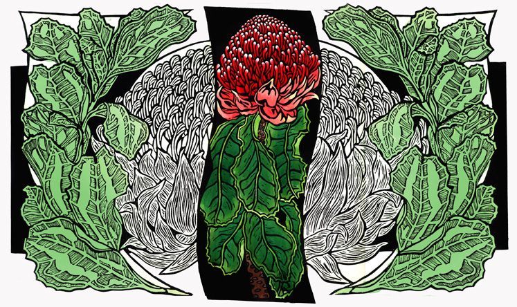
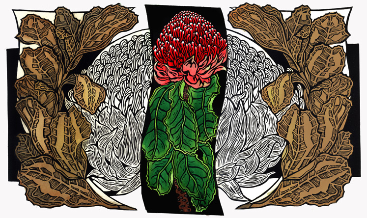
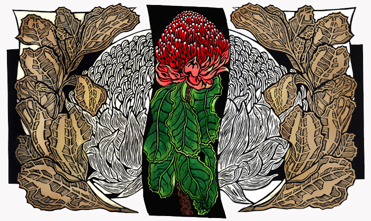
Here are the 3 colour samples I’ve worked on so far – I’ve noticed that some computer screens really mess with the actual colours – Waratahs Watercolour 1 – has pale green outside leaves – Waratahs Watercolour 2 – has deeper sepia type colours and Waratahs Watercolour 3 – has pale sepia colours.
…still deciding…any suggestions? comments?…

Hi Lynn – I have just started using wordpress and came across your blog – I see you have been busy. We met some years back, firstly online on Print Australia and then in Glen Innes where I was living then. I am in Canberra now so I will be able to go and see your new work at discovery next week.
Cheers
Pete
Hi Pete,
Yes I remember! You’ve moved to another cold climate (well at least in winter…). The Wildlife Art @ Discovery should be good – unfortunately it’s a bit far for me to travel to see. Have you a blog? Are you still printmaking?
kind regards
Lyn
Hi Lynn,
Yes I like a cold climate (and try to escape canberra in summer). I have just started a blog a few days ago – petemclean.wordpress.com – not sure why my name in the comment above does not give a link to it? Still learning how to set up all the settings and the like. Still very much printmaking. I am in my third year at the ANU School of Art in the printmedia and drawing workshop – so not doing huge amounts of work outside of uni stuff, though I did manage a solo show back up in Glen Innes last year – mostly drawings. Good to see you are still hard at it.
Pete
Hi Lynn
thanks for your link – I have returned the favor. As for your colour testing – I think my personal favorite is the dark sepia – though it is sometimes hard to say from a screen image. I’m also assuming the currently uncoloured parts either side of center will be red and green?
Yes I know Ampersand Duck – she does indeed work and teach in the book studio which is attached to the print workshop at ANU.